CSS grid by examples
Three column grid layout
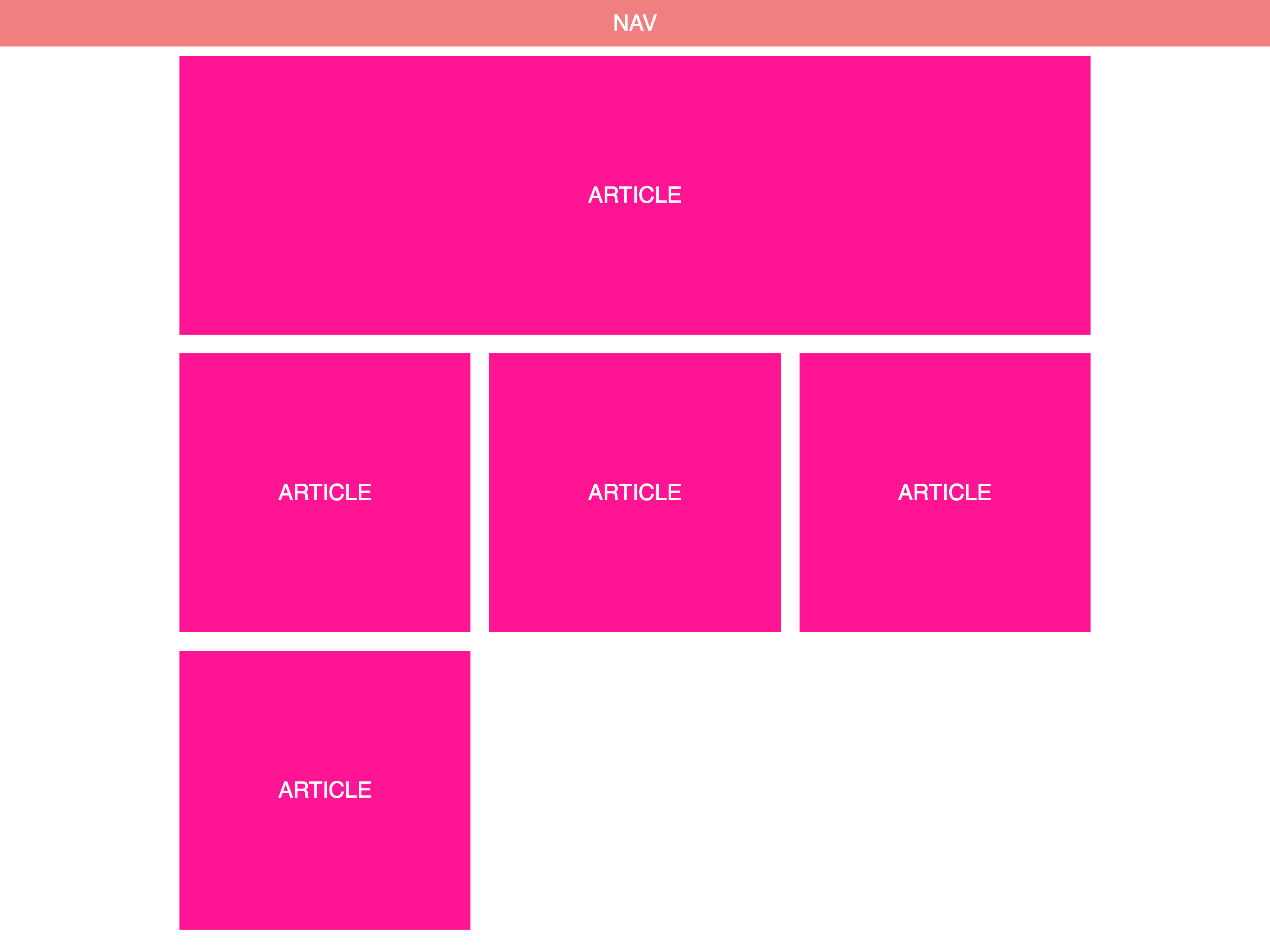
The next example is a three column layout that could be used for example in a blog or a news site. It has a navbar and a grid that uses a automatic layout for it’s child elements.
Here’s the HTML structure we will be using
<!DOCTYPE html>
<html lang="en">
  <head>
    <meta charset="UTF-8" />
    <meta name="viewport" content="width=device-width, initial-scale=1.0" />
    <meta http-equiv="X-UA-Compatible" content="ie=edge" />
    <title>Three column layout</title>
  </head>
  <body>
    <nav>
      <div class="title">Nav</div>
    </nav>
    <main>
      <article class="hero">
        <div class="title">
          Article
        </div>
      </article>
      <article>
        <div class="title">
          Article
        </div>
      </article>
      <article>
        <div class="title">
          Article
        </div>
      </article>
      <article>
        <div class="title">
          Article
        </div>
      </article>
      <article>
        <div class="title">
          Article
        </div>
      </article>
    </main>
  </body>
</html>
In this layout we will not be using grid for the whole page. Instead we will use conventional layout method like position and margin for the navbar and positioning the grid container. We will then use a grid for the layout of the content.
Let’s get the navbar CSS out of the way
nav {
    position: sticky;
    top: 0;
    width: 100%;
    height: 50px;
}
position: sticky with top: 0 will give us the nice effect with the navbar staying at the top of the screen when the user scrolls down the page.
Next, let’s take a look at the grid container CSS
main {
    width: 80%;
    max-width: 1000px;
    margin: auto;
    display: grid;
    grid-auto-flow: row dense;
    grid-template-columns: 1fr 1fr 1fr;
}
First we define the width and max-width we want an center the element by setting margin: auto. Then we use grid-template-columns to create three equal width columns.fr (or fraction) is a new CSS unit for grid definitions that can be used to define column or row sizes.
With grid-auto-flow we define, how the our grid will be filled. row will instruct the browser to fill each row in turn and dense wil cause it to fill the rows densely changing the order of the items if necessary.
article {
    grid-column: span 1;
    height: 300px;
    margin: 10px;
}

.hero {
    grid-column: span 3;
}
The article elements have a grid-column declaration with the value of span 1. This will make the article elements take 1 column of space. The .hero class is applied to the first article and it will change the grid-column value to span 3.